Most people think AI art is about the prompt.
It’s not.
If you’re trying to create something that could survive a serious jury — especially one connected to a museum tradition — AI becomes less like a magic wand and more like a brutally honest creative partner: it helps you see the gaps you didn’t know you had, then forces you to close them one by one.
That’s exactly why I used Gemini AI to build my submission for an open call based on a Rijksmuseum masterpiece. I didn’t want a “pretty AI image.” I wanted a remix that looks believable at first glance — and gets more interesting the longer you stare at it.
This is the story of how I went from “idea” to “print-ready submission,” and what I learned in the process.
Step 1: Start where most people don’t — the brief
Before touching visuals, I asked Gemini to analyze the open call itself.
Not “summarize it,” but decode it:
- What does “remix” mean here (not collage, not filter)?
- What are the constraints that can disqualify you?
- What does a jury usually reward in this kind of competition?
Then I asked Gemini to take a step further: assume the jury mindset. Even without knowing names, you can infer the logic: museum culture values craft, coherence, restraint, and concept. A jury may appreciate bold ideas — but they punish sloppy execution fast.
That early analysis gave me a north star:
If the physics doesn’t work, the concept doesn’t matter.
Step 2: Define a “winning vibe” — not a subject
This was the first major decision: I didn’t want to “decorate Vermeer.” I wanted to collide worlds.
We defined the vibe as:
Dutch Golden Age stillness meets digital-era anxiety — without losing realism.
It had to feel like a real moment, not a staged fantasy. A believable scene with a crack in reality.
Step 3: The modern lens — street photography, not “AI aesthetics”
I already work with street photography in the AI space (including my ongoing project “Streets of Chicago”), so I leaned into what I know: the feeling of a captured moment.
Gemini suggested three street photographers whose visual language could bridge classical calm with contemporary strangeness. I analyzed all three and chose Julie Hrudová.
Why?
Because her work isn’t just “surreal.” It’s often surreal in a street-photography way:
- directness
- flash energy
- a sense of “caught in the act”
- the humor and discomfort of reality behaving slightly wrong
That mattered — because the weakest AI images tend to look too polite. Too balanced. Too “made.”
Hrudová’s influence gave me permission to break the perfection.
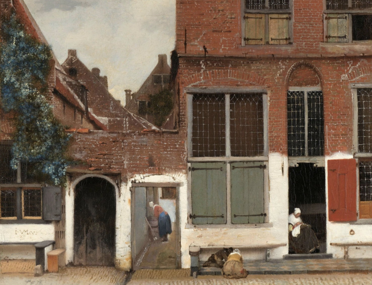
Step 4: Choose the right Old Master — not the most famous one
Gemini proposed three Rijksmuseum-connected anchors:
- Vermeer — The Little Street
- Rembrandt — The Night Watch
- Breitner — The Bridge
We chose Vermeer’s View of Houses in Delft (The Little Street) (1658) for a very practical reason:
It’s quiet enough to accept disruption.
Rembrandt fights back — it’s already dramatic. Vermeer doesn’t. Vermeer invites intrusion, which makes the intrusion louder.
Then we did the part people skip: we analyzed Vermeer’s DNA — not the story, but the mechanics:
- composition geometry
- texture contrast (brick vs plaster vs wood)
- light logic
- the calm of everyday domestic architecture
That “DNA” became my checklist for realism later.
Step 5: Find a real modern street that carries the same soul
I asked Gemini a strange question:
If Vermeer painted today in Amsterdam, where might he stand?
Gemini suggested three streets with similar “old Dutch passage” energy. We explored them and chose Begijnensteeg, because it offered:
- a portal-like depth
- heavy brick texture
- a natural stage for light vs shadow
- enough visual silence to make one surreal detail feel enormous
Next, we planned the shot like a real photographer would:
- framing
- focal length feeling
- light direction
- the moment of contrast
This mattered because if the “base photo” is weak, every later step becomes damage control.
Step 6: Generate the base — then accept that the real work starts after
Using Gemini / Nano Banana Pro prompts, I created a strong base image in the spirit of Hrudová: a street-photography frame that already felt plausible.
Then I pushed it toward a remix.
At this stage, my goal wasn’t “more weird.” My goal was:
Make the original feel true — then introduce one impossible thing.
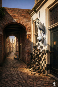
So I started adding elements:
- a surveillance camera
- a heron perched on it (a natural watcher)
- voxel/pixel “decay” in the wall — as if the street is turning into a digital simulation
- subtle modern hints (like the scooter), placed so they feel discovered, not inserted
This is where the process turned into an endurance sport.
Step 7: The brutal part — physics, anatomy, and the tyranny of shadows
The hardest phase wasn’t creativity. It was coherence.
Every time I added something, Gemini became my technical critic:
- Is the shadow direction consistent?
- Does the bird actually grip the camera, or is it floating?
- Do the pixels have weight and depth, or are they stickers?
- Do the modern materials look like metal and glass, or like painted clay?
- Does the scene still feel like one photograph?
This created loops. Many loops.
That’s the hidden truth:
High-quality AI art is iterative art direction.
It’s “generate → critique → fix → critique → fix.”
Not once. Dozens of times.
Step 8: The “masterstroke” detail — the reflection
At some point, we hit a conceptual gap: the image was beautiful, but still felt like a tableau.
Gemini suggested a single addition that changed everything:
Put the photographer’s reflection in the security camera dome.
This did three things at once:
- A sophisticated nod to Dutch painting traditions (hidden reflections and optical play).
- A street-photography trick: it becomes a captured event, not a staged scene.
- A narrative loop: the watcher is being watched.
The reflection had to be subtle, warped by the dome curvature, not a selfie. Done right, it becomes a reward for the viewer who leans in close.
Done wrong, it becomes gimmick.
We iterated until it felt physically believable and narratively necessary.
Step 9: Packaging for jurors — title and statement that don’t overtalk
I asked Gemini to help craft the title and artist statement — not to sound “AI poetic,” but to land fast with jurors who read dozens of entries.
My title: The Glitch in Delft
And the statement was built to do one job:
- explain the concept in plain language
- name the key visual loop (surveillance → heron → reflection → viewer)
- frame the voxel decay as meaning, not decoration
In competitions, clarity wins.
Step 10: Finish like a printmaker, not a prompter
The final step was production: upscaling, noise handling, sharpening, and print-readiness.
If you’ve ever printed large, you know the rule:
A1 size will reveal every weakness.
So I treated the file like a serious print:
- controlled noise reduction (don’t smear texture)
- restrained sharpening (don’t create halos)
- checks at 100% on critical areas: edges, sky transitions, the heron, the reflection
The goal wasn’t “crispy.” The goal was “believable.”
What I learned
If I had to compress the whole experience into a few sentences:
- AI doesn’t replace craftsmanship — it relocates it.
- “Museum-grade” is 80% about physics and restraint.
- The difference between “nice” and “serious” is coherence: light, weight, texture, intent.
- The best AI workflow is less about prompting and more about creative direction and ruthless editing.
- A strong concept is necessary — but realism is the gatekeeper.
Or, put simply:
If your shadows lie, your story collapses.
If you want, I can also produce a shorter LinkedIn version of this (tight hook + 3 lessons + 1 image + CTA), or a Forbes-style “5 principles” format that’s more skimmable.